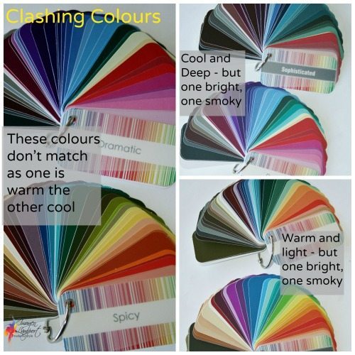
As someone who has always been fascinated by art and design, one of the most intriguing aspects for me has been the use of color. Whether it’s in a painting, a room decor, or even in fashion, colors play a pivotal role in creating a mood and conveying a message. However, there has always been a debate about whether it’s better to clash or harmonize colors in various settings. In this blog post, we will delve into the mix and match dilemma and explore the beauty and power of both approaches.
Let’s start with the clash, also known as the “color blocking” technique. This approach embraces boldness and aims to create a visual impact by combining contrasting hues. When executed correctly, the result can be truly breathtaking. Imagine a vibrant red paired with a striking turquoise or a brilliant yellow contrasting with deep royal blue. The clash of colors can create excitement and make a bold statement, demanding attention wherever it is applied.
Color clashes are often associated with modern and contemporary designs, as they instantly add a touch of uniqueness and avant-garde to any space. By intentionally breaking color rules and mixing unlikely pairings, we can create a dynamic visual experience. It takes a certain level of confidence and artistic knowledge to master the art of color clashing, but the results can be extraordinary, adding energy and vitality to any setting.
On the other hand, we have the concept of harmony. This approach focuses on creating a cohesive and balanced color palette, where the colors blend seamlessly, working together to create a sense of unity and tranquility. Think of the delicate pastel colors of a spring meadow or the earthy tones of a cozy autumnal scene. A harmonious color scheme can evoke a feeling of peace and serenity, and it is often associated with traditional and timeless designs.
Harmonious color schemes are based on color theory, using complementary, analogous, or monochromatic color combinations. Complementary colors, such as blue and orange or yellow and purple, sit opposite each other on the color wheel, creating a pleasing contrast that is aesthetically pleasing. Analogous colors, like blue and green or orange and red, are adjacent on the color wheel, providing a gentle and flowing transition. Monochromatic color schemes involve using different shades and tones of a single color, providing a soothing and elegant effect.
The choice between clashing or harmonizing colors ultimately comes down to personal preference and the desired effect you want to achieve. Both approaches have their merits and can be used to great effect depending on the context. It’s important to consider factors such as the purpose of the space, the mood you want to evoke, and the overall aesthetic you are aiming for.
If you’re feeling adventurous and want to make a bold statement, color clash might be the way to go. It can infuse a sense of energy and vibrancy into a space, creating a visual feast for the eyes. On the other hand, if you seek a sense of tranquility and want to create a more peaceful ambiance, harmonizing colors will help you achieve that. It can bring a sense of balance and coherence to a room, making it feel comfortable and inviting.
Of course, there are no hard and fast rules when it comes to color usage. Creativity is key, and sometimes the most interesting and compelling designs come from combining clash and harmony. The juxtaposition of contrasting colors within a harmonious context can create a truly unique and captivating visual experience.
In conclusion, whether you prefer the excitement and boldness of color clashes or the soothing and balanced aesthetics of harmonizing colors, both approaches have their own appeal and can transform any setting into a work of art. So go ahead, experiment, and let your imagination guide you in creating spaces that reflect your personality and bring joy to your surroundings. After all, the beauty of color lies in its endless possibilities, and it’s up to you to mix and match them in a way that speaks to you personally.
